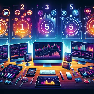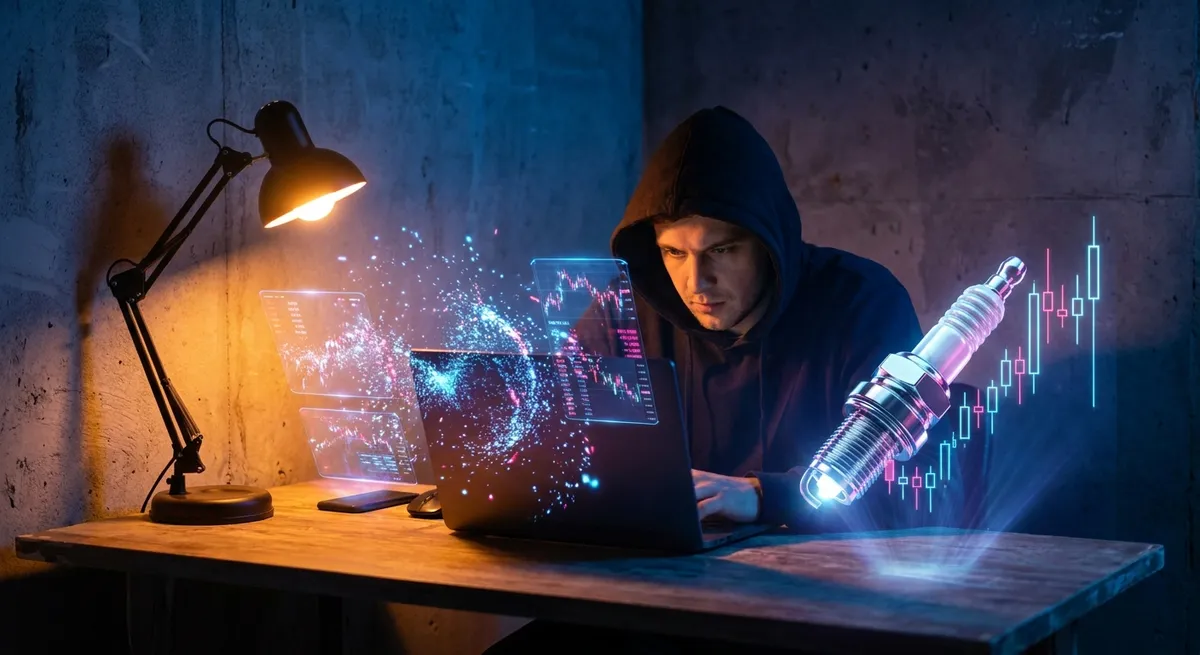
If your trading screen still looks like it did in 2019, you’re leaving edge on the table. Forex in 2026 is a different beast—faster flows, tighter spreads, and tools that feel less “spreadsheets and stress” and more “gaming HUD meets Bloomberg.” This isn’t about adding more indicators; it’s about upgrading your entire trading experience so your tools move at the same speed as the market—and your ideas.
Below are five trading-tool trends lighting up group chats, Discords, and X (Twitter) threads right now. These are the features smart traders are flexing in screenshots—and quietly using to squeeze out better execution and cleaner decisions.
1. Real-Time Liquidity Heatmaps: Seeing the Order Book as a Battlefield
Old-school depth-of-market windows are out; visual liquidity heatmaps are in. Instead of staring at rows of numbers, traders are watching price levels light up like a radar screen—showing where liquidity clusters, spoof orders fade, and real size steps in.
These tools overlay:
- Liquidity pockets (where big orders are sitting)
- Absorption zones (where large players keep price pinned)
- Sudden liquidity vacuums (where price can rip with almost no resistance)
Why it matters for forex:
- You spot “fakeout zones” where price spikes into visible liquidity then instantly reverses.
- You stop placing stops right on top of obvious liquidity magnets.
- You see when a breakout is backed by real volume instead of retail FOMO.
This kind of visual edge is ultra-shareable—traders are posting heatmap clips of “before and after” moves, circling the exact level big money defended, and using them as receipts when they called the move in advance.
2. AI-Powered Session Recaps: Your Trading Day Turned Into a Highlight Reel
The hottest tools right now aren’t just helping you place trades—they’re breaking down your whole session like a coach reviewing game film.
Modern trading journals are layering AI on top of your trade history to:
- Auto-tag trades: trend, countertrend, news-driven, revenge trade, range play
- Identify your strongest setups based on win rate and risk-adjusted return
- Call out emotional patterns like overtrading after a loss streak
- Generate clear summaries like: “Your London breakout trades outperformed New York reversals by 2.3R on average.”
The viral factor? Traders are screenshotting their AI-generated insights:
- Win-rate by session (London vs. NY vs. Asia)
- P/L by pair (EURUSD vs. XAUUSD vs. GBPJPY)
- Best/worst day-of-week performance
Suddenly, “I trade best during London open” isn’t a hunch—it’s a stats-backed flex. And once you can see the patterns, you can actually lean into what’s working instead of randomly grinding every session.
3. Macro Dashboards That Turn Data Releases Into Playable Setups
Instead of opening ten tabs before NFP or CPI, traders are consolidating everything into one dynamic macro dashboard. These tools aren’t just showing this month’s print—they’re giving you:
- Historical surprise vs. forecast for each data release
- Typical FX reactions (e.g., “On above-forecast US CPI, DXY rallied in 7 of the last 9 releases.”)
- Volatility ranges pre- and post-event for your favorite pairs
- Correlation shifts between currencies, yields, and indices
For macro-aware traders, this turns news from “scary spike candle” into “structured event play.” You can prep:
- If–then scenarios: “If CPI beats, I’m looking for USD strength vs. JPY first.”
- Expected volatility windows: widen stops or reduce size around events.
- Clear “no-trade” zones when data is too mixed or already priced in.
These dashboards are screenshot gold on social: traders post their pre-event bias, the dashboard probabilities, and then the post-event chart. It’s a clean way to show you weren’t guessing—you had context.
4. Multi-Timeframe Pattern Scanners: Finding Your Setup While You Sleep
Manual chart scanning across 20+ pairs and 4 timeframes is a fast track to burnout. The new wave of pattern scanners act like 24/7 scouts hunting for your exact playbook:
- Double tops / bottoms
- Break-of-structure (BoS) and market structure shifts
- Channel breaks, flags, and wedges
- Fair value gaps or supply/demand zones (for the smart money crowd)
The key is custom filters. You’re not just letting the tool ping every minor swing high—it’s scanning for:
- Only pairs you trade
- Only timeframes you care about (say H1, H4, D1)
- Only patterns aligned with broader trend or moving average bias
This is incredibly shareable because it turns “I caught this perfect setup” into “my scanner alerted this while I was at the gym.” Traders love posting:
- The scanner alert screenshot
- Their execution chart
- The outcome, with entry marked right off the alert
It’s not about outsourcing your brain; it’s about outsourcing the hunt, so your energy goes into planning and execution instead of endless scrolling.
5. Social Trading Rooms With Transparent Stats and On-Chart Commentary
Signals with no proof are dead. The new trend is social trading rooms where every shared idea is tied to hard numbers and trade history:
- Verified performance profiles connected to broker or platform data
- On-chart comments showing exact entry, stop, and target zones
- Live risk disclosures like “Risking 0.5% on this idea, invalidation at 1.0790”
The best tools are merging:
- Real-time chat
- Chart-sharing
- Embedded trade journals
- Leaderboards sorted by consistency, not just raw P/L
Why this is blowing up:
- Traders can filter who they follow by style (scalper, swing, macro) and pair focus.
- You can backtest how someone’s live calls actually performed over weeks or months.
- Content creators can build trust with transparent track records instead of cherry-picked wins.
And from a social angle, it’s pure gasoline. People are clipping live call screenshots, later overlaying the final move, and posting “Called this in room at 1.0830—market tapped 1.1000.” That combo of transparency plus community is what’s turning quiet analysts into mini brands.
Conclusion
In 2026, the edge isn’t just about being smarter—it’s about being better equipped. The traders winning right now are the ones who:
- See liquidity instead of just candles
- Treat AI as a personal trading coach
- Turn macro chaos into structured scenarios
- Let scanners do the boring work
- And surround themselves with transparent, stats-backed communities
If your platform feels clunky, manual, or blind to how you actually trade, that’s not just an inconvenience—it’s drag on your performance. Upgrade your tools, and your process, clarity, and shareable “look at this setup” moments level up with it.
Sources
- [Bank for International Settlements – Triennial Central Bank Survey (FX Market Data)](https://www.bis.org/statistics/rpfx22.htm) - Authoritative stats on global FX turnover and market structure trends
- [Investopedia – How to Use Market Depth](https://www.investopedia.com/terms/m/marketdepth.asp) - Explains depth-of-market and liquidity concepts that underpin heatmap-style tools
- [IMF – Exchange Rates and the Macro Economy](https://www.imf.org/en/Topics/exchange-rates) - Context on how macroeconomic data and policy shifts drive currency moves
- [CFTC – Commitments of Traders (COT) Reports](https://www.cftc.gov/MarketReports/CommitmentsofTraders/index.htm) - Official positioning data often integrated into advanced FX dashboards
- [CFA Institute – The Role of Trading Analytics in Investment Management](https://www.cfainstitute.org/en/research/foundation/2019/the-role-of-trading-analytics) - Deep dive into how analytics and trade data are used to improve performance and decision-making
Key Takeaway
The most important thing to remember from this article is that this information can change how you think about Trading Tools.